Dashboard
How to Overview Team Performance
We believe that effective dashboards should deliver information with clarity and precision. timefixer offers a dashboard that is intuitive, easy to use, and elegantly designed, making it simple to extract valuable insights.
What does the Dashboard in timefixer showcase?
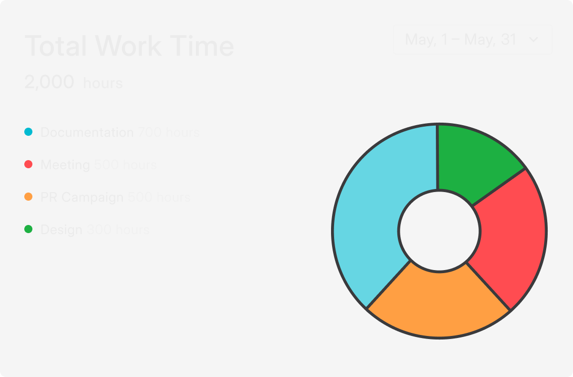
Total Work Time
The first widget you see after clicking on the Dashboard button in the left sidebar is the Total Work Time widget. This widget features a chart that displays exactly how many hours were spent on specific projects or tags. You can select any time period for detailed analysis.

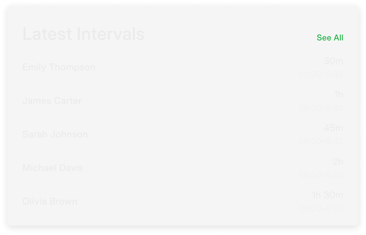
Latest Intervals
This section showcases all the latest time intervals. By clicking See All, you can access every recorded interval within a specified time range, offering a deeper dive into team activity.

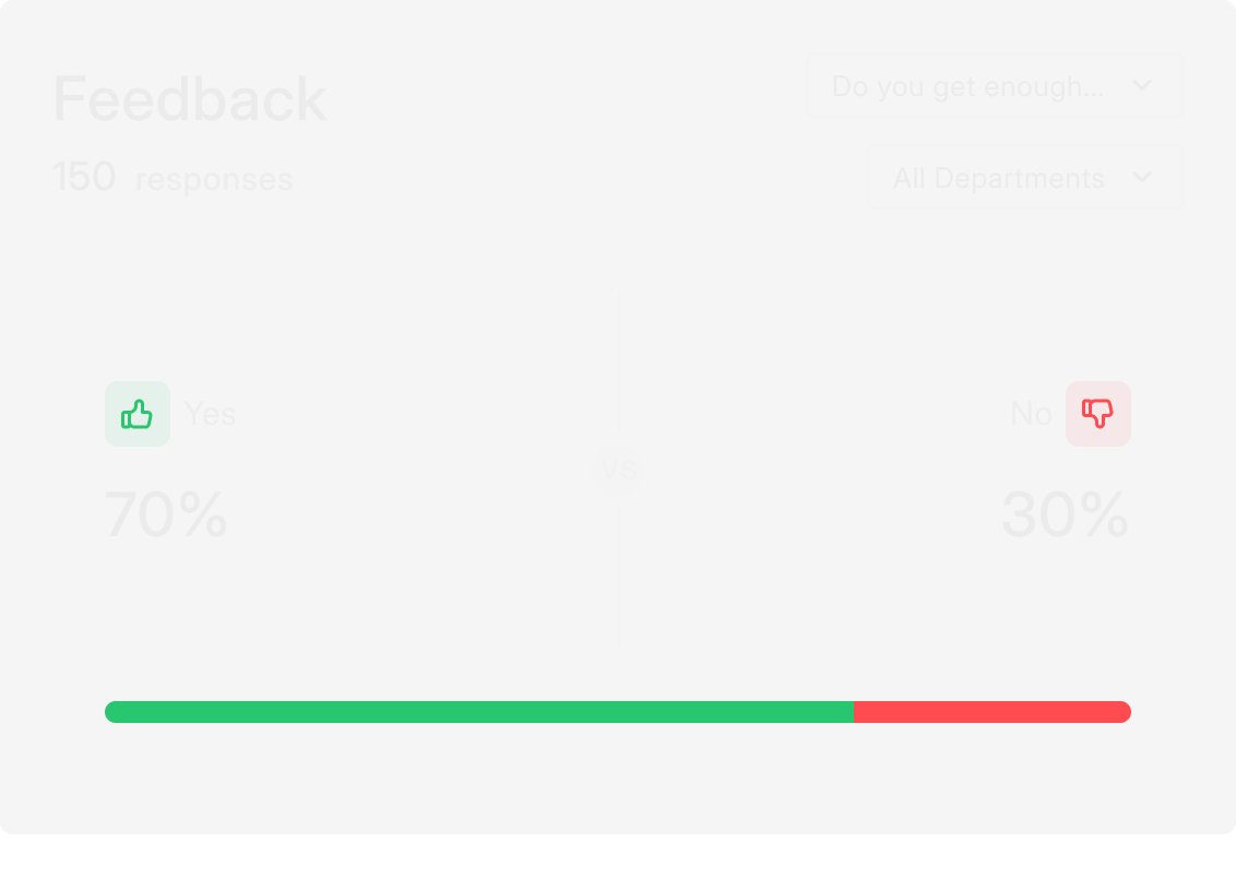
Survey Responses
Below, you’ll find all the statistics for the surveys you’ve set up. The data is presented in a vivid, clear, and colorful manner—just as a great dashboard should be.

The timefixer Dashboard serves as your command center for tracking and improving team performance. With its sleek design and comprehensive analytics, it provides all the insights you need to make informed decisions and keep your projects on track. Whether you’re reviewing work hours, intervals, or survey results, timefixer makes performance monitoring effortless and efficient.